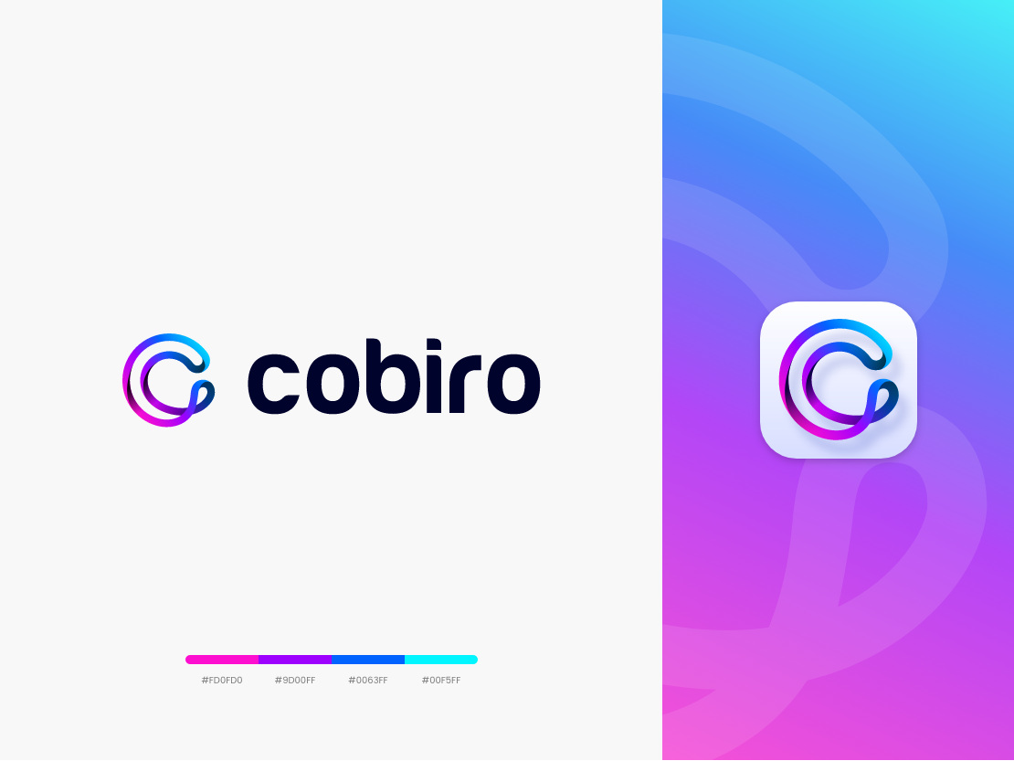
Refreshed, redesigned, revolutionized
As Cobiro is expanding its product portfolio, we thought it was time to freshen up our logo and look to reflect that change. What started as a simple ad flow for marketers a few years ago is now a full-service platform for online success. Cobiro still offers smarter advertising flows, but has also implemented a free website builder and free domain extensions to get business owners started with a successful online presence.
Cobiro understands that advertising alone will not make you successful online, which is why we’ve made this shift to be more inclusive. Our mission? To help small businesses build their business online, grow their engagement, and promote their products and services.
"In the last year or so, Cobiro has successfully scaled its service offerings by broadening our product portfolio to include a more diverse customer base. Our new logo better reflects our inclusive position and openly demonstrates the comprehensive platform of services we bring to customers all over the world."
- Bo Krogsgaard, CEO and co-founder of Cobiro
What story does the new logo tell?
The new logo evokes a feeling of positivity, and the fluid movement of the lines signify movement, inspiration, and simplicity. The lines form an infinity symbol which represents Cobiro’s lifecycle of services while the two lines can be interpreted as the duality of our product portfolio; online presence and advertising. Where the two lines intersect is a symbol of how we meet our customers eye-to-eye.
"The new logo is a significant change from the previous in order to better represent who Cobiro is and what we offer to our customers at this point in time. The look of our new logo is innovative, modern, flexible - words we would use not only to describe our brand but also the multitude of businesses we represent."
- Morten Korshavn, Head of Design
The infinity C is elastic, honoring the flexibility of our platform and the solutions we provide to small businesses everywhere. The C is upward-turned to signify growth, opportunity, and success. Changing the black/white color scheme from the previous logo to a playful selection of colors with a calm gradient removes some of the gravitas and infuses the new logo with creativity and innovation.
Another important factor is the shift from capitalized letters to lower-case letters. Cobiro should be friendly, inclusive, and easy-to-use at all times. Lower-case, rounded letters with an organic feel will help underline that openness and perhaps also infuse our company with a pinch of animation.


